I propose CSS animation-curve which could work like that :
animation-curve: angle size,angle size.
For example :
animation-curve: 45(deg) 30px,-45(deg) 30px;
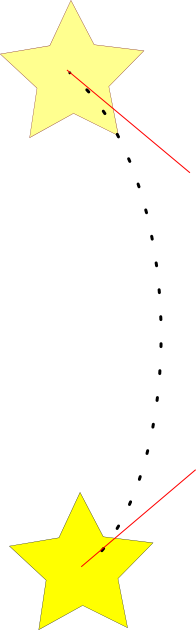
Note : In the two pictures, the star is the object to move. Its trajectory is represented by the black dotted line, and red lines are representing the tangent of the trajectory.
On the first picture, the first star start on top and move down following his trajectory during the time of the animation.
The second tangent is facultative if the developper want is two tangent parallel and with the same size.
For example :
animation-curve : -90(deg) 50px;
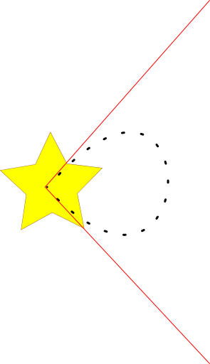
Also this method allow object to turn in round when keeping the same position at start and at the end of animation with an animation curve like that :
animation-curve: -45(deg) 70px, 45(deg) 70px;
You probably noticed that it's quite the same code as the first example, it's why this propertie should be use with the object position.
It's only when the object is moving that the animation-curve should take effect, also it is important to say that animation curve should be easily redefine in each key of animation to allow complex animations movements.
Would you use it ? Is there another way to do it ? What do you think about ?